Strategy
conversion rate tips for websites, high converting landing page tips, how to build a landing page that converts, how to improve landing page conversions, improve conversion rate website, improve website conversions, landing page best practices for small business, landing page conversion tips, landing page CTA best practices, landing page design for conversions, landing page for paid ads, landing page formula for better conversions, landing page formula for small business, landing page mistakes small business, landing page optimisation for small business, landing page structure for small business, landing page trust signals, small business landing page strategy, small business landing page tips, website conversion optimisation
SEO Checker
0 Comments
The Small Business Landing Page Formula That Converts Better Traffic
A lot of small businesses work hard to get more traffic.
They improve SEO.
They publish blog posts.
They run ads.
They post on social media.
They try to rank for more keywords.
But then something frustrating happens:
The traffic comes… and the results still feel weak.
Visitors land on the page, look around for a few seconds, and leave.
No enquiry.
No booking.
No sale.
No meaningful action.
This is where many businesses realise a hard truth:
Traffic alone is not the goal. Conversion is.
If the page someone lands on is unclear, weak, slow, or unconvincing, more traffic often just means more wasted opportunity.
That is why landing pages matter so much.
In this guide, we’ll break down a practical small business landing page formula that helps turn better traffic into better results. If you’ve been looking for landing page conversion tips or ways to improve website conversions, this is the structure to focus on.
Why Small Business Landing Pages Fail So Often
Most small business landing pages are not built to convert.
They are usually built to:
- look decent
- explain the service broadly
- “have a page for ads”
- tick a box on the website
That creates pages that are often:
- too vague
- too busy
- too slow
- too generic
- too focused on the business instead of the customer
- missing trust signals
- full of distractions
A landing page should not just “exist”.
It should guide a visitor toward one clear action.
That might be:
- booking a call
- requesting a quote
- starting a free trial
- filling in a contact form
- making a purchase
If the page doesn’t make that path obvious and convincing, the traffic underperforms.
Traffic Is Only Valuable If The Landing Page Deserves It
This is a key idea that many businesses miss.
If you send people to a weak landing page, traffic becomes an amplifier of problems.
It exposes:
- unclear messaging
- poor design decisions
- weak trust signals
- slow load times
- confusing offers
- friction in the user journey
This is exactly why we wrote about The Marketing Trap: Why Most Businesses Promote Before They’re Ready.
If you are already sending traffic to a page that isn’t ready, promotion usually just wastes budget faster.
That’s why the landing page itself needs to be treated as part of the marketing strategy — not something separate from it.
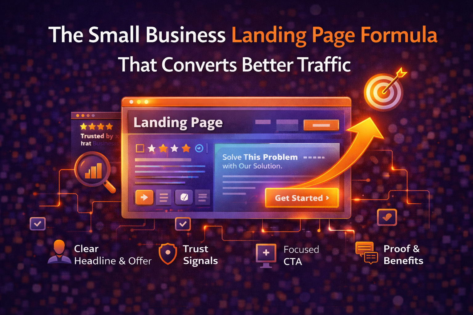
The Small Business Landing Page Formula
A strong landing page usually doesn’t need to be clever.
It needs to be:
- clear
- focused
- trustworthy
- relevant
- easy to act on
Below is a practical structure that works well for many small businesses, service providers, agencies, consultants, and local companies.
1. Start With a Clear Headline That Matches the Visitor’s Intent
Your headline is the first thing most visitors use to decide whether they are in the right place.
If it’s vague, clever, or too broad, people often leave before they even read the rest.
Weak headline examples:
- “Helping Businesses Grow”
- “Professional Solutions for Modern Brands”
- “Welcome to Our Services”
These don’t clearly tell the visitor what they are getting.
A stronger landing page headline usually says:
- what the offer is
- who it is for
- what outcome it helps create
For example:
- Technical SEO Audits for Small Business Websites
- Book a Free Website Review for Your Local Business
- Affordable PPC Management for UK Service Businesses
This matters because the headline should match the promise of the traffic source.
If someone clicked an ad, a blog link, or a search result expecting one thing, the landing page should immediately confirm they are in the right place.
That alignment is one of the most important landing page conversion tips.
2. Make the Offer Obvious Above the Fold
“Above the fold” means what the visitor sees before scrolling.
This area is critical.
A lot of small business landing pages waste it with:
- oversized banners
- generic stock imagery
- vague brand statements
- cluttered navigation
- no clear next step
Instead, the top of the page should make three things obvious straight away:
- what you offer
- who it is for
- what the visitor should do next
A simple above-the-fold structure often works best:
- headline
- short supporting subheading
- clear CTA button
- trust signal or proof element
- clean visual layout
For example:
Headline: Free SEO Audits for Small Business Websites
Subheading: Discover technical and on-page issues that may be holding your rankings back.
CTA: Run a Free SEO Check
Trust Signal: No sign-up required • Checks 50+ SEO elements • Instant results
3. Add Immediate Trust Signals Early
Visitors decide quickly whether a page feels trustworthy.
If trust is weak, even good traffic struggles to convert.
That’s why strong landing pages usually include trust signals above the fold or very near it.
Useful trust signals include:
- testimonials
- review scores
- “trusted by” statements
- years of experience
- number of clients served
- no-risk messaging
- recognised partners or platforms
- real credentials or certifications
A landing page without trust signals often feels like an ad with nowhere solid to land.
If your page is asking someone to take action, it should also reassure them quickly.
4. Use One Focused CTA, Not Five Competing Ones
A lot of landing pages fail because they try to do too much.
The page asks the visitor to:
- read the blog
- join the newsletter
- follow on social media
- explore multiple services
- click three different buttons
- browse the whole site
That creates friction and decision fatigue.
A landing page should usually have one main goal.
For example:
- book a consultation
- request a quote
- start a free check
- sign up for a demo
That doesn’t mean you can only have one button on the page.
It means the page should repeat the same main CTA consistently.
For example:
- top of page: Run a Free SEO Check
- middle of page: Run a Free SEO Check
- bottom of page: Run a Free SEO Check
Clarity wins.
5. Lead With Benefits, Not Just Features
This is one of the most common conversion mistakes.
Small businesses often describe what their product or service has rather than what it does for the customer.
Features are useful.
But benefits usually convert better.
Feature-focused copy:
- checks 50+ SEO elements
- 3-step onboarding
- weekly reports
- 24-hour support
Benefit-focused copy:
- spot the issues that may be holding your rankings back
- get started quickly without a complicated setup
- stay on top of problems before they affect traffic
- get answers fast when you need help
The best landing pages usually combine both.
They explain the feature, then connect it to the customer outcome.
This is especially important if you want to improve website conversions rather than just attract visitors.
6. Remove Unnecessary Distractions
Landing pages perform better when they feel focused.
That means removing anything that pulls attention away from the main action.
Common distractions include:
- full site navigation with too many options
- multiple unrelated CTAs
- too much text too early
- irrelevant sections
- social icons stealing clicks
- unnecessary popups
- competing offers on the same page
A landing page is not always the place for “everything”.
It’s the place for the next step.
If the page is designed to get a quote request, the page should support that one goal.
This is one reason why many ad campaigns underperform — not because the ads are bad, but because the landing page behaves more like a homepage than a conversion page.
7. Add Proof and Credibility Throughout the Page
Trust shouldn’t appear once and disappear.
The best landing pages reinforce confidence throughout.
That can include:
- short testimonials after the headline
- results or outcomes in the middle of the page
- FAQs that remove objections
- case studies or mini examples
- real client names where appropriate
- screenshots or visuals of the process
- service guarantees if relevant
For example, a landing page for an SEO audit service might include:
- “Used by small business owners, founders and service providers”
- a testimonial from a customer
- a short note about common issues found
- a simple explanation of how the audit works
- a final CTA with reassurance
This kind of layered proof is often what separates “looks fine” pages from pages that actually convert.
8. Match the Promise of the Traffic Source
This is a major one, especially if you use ads, email campaigns, or social promotion.
If the traffic source says one thing and the landing page says another, conversions usually drop.
For example:
Ad or post promise:
- “Free SEO Checker for Small Business Websites”
Bad landing page:
- generic homepage with multiple offers, blog links, and broad messaging
Better landing page:
- focused page that clearly says:
- Free SEO Checker
- built for small websites
- what it checks
- why it matters
- clear CTA to start
This alignment reduces friction and increases trust.
The same principle applies after the click:
If the landing page does not satisfy the intent that brought the visitor there, conversion suffers.
9. Make Sure the Page Loads Fast and Works Well on Mobile
A landing page can have excellent copy and still underperform if the user experience is poor.
If the page is:
- slow to load
- jumpy on mobile
- hard to read
- awkward to click
- visually broken
…many visitors will leave before they even evaluate the offer.
This is especially important because a large percentage of small business traffic now comes from mobile devices.
A few practical basics:
- compress images
- avoid heavy scripts where possible
- make buttons easy to tap
- keep forms simple
- use readable font sizes
- avoid layout shifts
- test the page on real mobile devices
This is also where Site Academy can naturally fit into the process, because technical issues and page performance problems often reduce conversion before you even get into copy or design.
10. Keep Forms Simple and Low Friction
If your landing page ends with a form, the form itself matters more than many people realise.
Long forms often reduce conversion unless the offer is very high intent.
For most small business landing pages, a form should ask for only what is genuinely needed.
Instead of:
- full name
- company name
- phone number
- website
- budget
- service type
- timeline
- industry
- message
- preferred contact method
…you might be better off starting with:
- name
- website or message
Less friction often means more completions.
You can qualify leads later.
The goal is to make the next step feel easy.
11. Use a Simple Landing Page Structure That Actually Converts
If you want a practical layout, this is a strong starting formula for small businesses.
Recommended structure:
Section 1: Above the fold
- clear headline
- short subheading
- primary CTA
- one trust signal
Section 2: Problem + solution
- what problem the visitor is facing
- how your offer solves it
Section 3: Benefits
- 3–5 key outcomes
- why it matters to them
Section 4: Proof
- testimonials
- case study snippets
- trust badges or credibility
Section 5: How it works
- simple 3-step explanation
Section 6: FAQs
- remove objections and uncertainty
Section 7: Final CTA
- repeat the main action clearly
This structure works because it follows how people think:
- Am I in the right place?
- Is this relevant to me?
- Can I trust this?
- How does it work?
- What should I do next?
Why Traffic Without Landing Page Quality Wastes Budget
This is one of the most important ideas in this entire article.
A lot of businesses think poor results mean they need:
- more traffic
- more SEO
- more ads
- more impressions
Sometimes the real issue is simpler:
The page they are sending people to is not strong enough.
That means every extra click becomes more wasted spend.
This applies to:
- Google Ads
- Facebook Ads
- LinkedIn traffic
- SEO traffic
- email campaigns
- referral traffic
That’s why landing page quality should be part of the acquisition strategy, not an afterthought.
More traffic to a weak page usually creates more disappointment, not more growth.
A Simple Landing Page Checklist for Small Businesses
Before you send more traffic to a page, ask yourself:
- Does the headline clearly match what the visitor wants?
- Is the offer obvious immediately?
- Is there one main CTA?
- Are trust signals visible early?
- Does the page explain benefits, not just features?
- Are distractions removed?
- Does the page match the promise of the traffic source?
- Is it fast and mobile-friendly?
- Is the form simple?
- Does the page feel credible enough to act on?
If several of these are weak, that’s often why conversions are lower than expected.
How Site Academy Fits Into This
This is where Site Academy can naturally become more than just an SEO tool.
A good landing page does not just need:
- rankings
- traffic
- technical compliance
It also needs:
- trust
- clarity
- speed
- focus
- good structure
- readiness before promotion
That broader view is important.
Because real growth doesn’t happen when traffic increases.
It happens when the right traffic lands on the right page and feels confident enough to take action.
That’s why using the Site Academy SEO Checker before scaling traffic is smart.
It helps you spot technical and on-page issues that may be weakening the page before you spend more time or money driving visitors to it.
The Real Goal Is Not More Clicks — It’s Better Outcomes
A lot of small business marketing advice focuses heavily on acquisition.
Get more traffic.
Rank higher.
Post more.
Spend more.
Promote more.
But the real growth usually comes from a better question:
What happens after the click?
That is where landing pages matter.
A strong landing page doesn’t need to be flashy or complicated.
It needs to:
- clearly match the visitor’s intent
- explain the offer quickly
- build trust early
- remove friction
- guide people to one clear action
If you get that right, the same traffic often performs much better.
And that means better results without always needing more reach.
Share this content:

Post Comment